Your Netflix account is about to look VERY different – as streamer rolls out biggest changes in 10 years
Netflix on Thursday began rolling out the first major refresh to its television app in a decade.
The world’s largest streaming service is currently testing changes that will help viewers decide more quickly what they want to watch on TV.
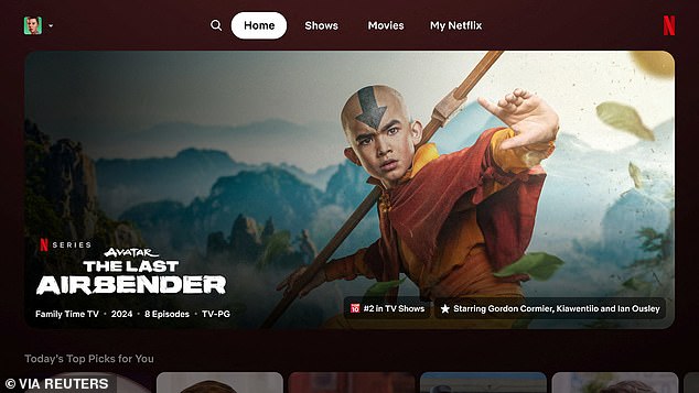
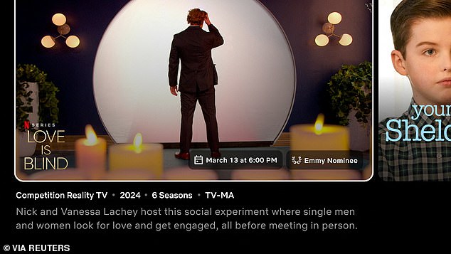
Instead of static tiles, the new look sees boxes that expand to show a preview and more information once your remote selects them.
Right now, on the TV app – which can be found on Apple TV, Roku devices and smart televisions – the trailer and cast details and a synopsis appear at the top of the screen.
Overall it’s simpler: customers get all the important information in one place. It looks a little less busy and more mobile-like.
The design of the new homepage for the Netflix app is shown. It limits the options previously available in the menu on the left

There is now a MyNetflix tab at the top, which was first rolled out on the mobile app. It provides quick access to titles you’ve recently viewed or saved
The changes come after company research found users engaged in what Netflix CEO Pat Flemming called “eye gymnastics” when trying to find a title to watch.
Viewers’ eyes darted back and forth from “the row name to today’s top picks, to the box art, to the video, back to the synopsis,” Flemming, senior director of member product, told Reuters in an interview.
“We really wanted to make that simpler, more intuitive and easier to navigate.”
The video streaming pioneer wants to increase the time viewers spend on the app to retain customers and attract subscribers to its new, cheaper plans with ads.
Revisions to the homepage include enlarging title cards, reorganizing information and highlighting easy-to-read tidbits, such as a show or movie that “spent 8 weeks in the top 10.”
Some of the nearly 270 million Netflix users around the world will see the new format from Thursday. They are selected at random.
The company will take feedback and possibly make changes before a wider reveal.
Netflix emphasizes engagement time as a key metric, telling investors it is the “best measure of customer satisfaction.”
The company will stop regularly reporting subscriber numbers next year to shift Wall Street’s focus.

Trailers appear in an enlarged tile, meaning viewers don’t have to look at the top of the screen. This borrows a feature from Hulu
Among other changes to the TV app, the menu button has been moved from the left to the top of the screen.
A new ‘My Netflix’ tab has been added, showing shows or movies that a user has started watching, or saved to check out later.
Netflix continues to provide personalized suggestions to each user. It is not making any changes to its recommendation algorithm as part of the redesign, Flemming said.
