Microsoft has replaced the default font for the first time in 17 YEARS – as furious users call the change ‘some kind of sick joke’
- Microsoft’s new font is Aptos – and the change isn’t going down well with users
- Luckily, if you’re still loyal to Calibri, there’s an easy way to change it back
If you use Microsoft Office, you’re probably used to your copy appearing in the standard Calibri font.
But the tech giant has caused a stir this week after replacing Calibri for the first time in 17 years.
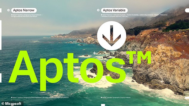
The new default font is Aptos – and the change isn’t going down well with users.
On TikTok, one user said, “Out of nowhere my work computer changed the default font from Calibri to whatever this is and it feels like some kind of sick joke.”
Luckily, if you’re still loyal to Calibri, there’s an easy way to change it back: here’s how.
Microsoft made waves this week after replacing Calibri as the default font for the first time in 17 years
Calibri has subtly rounded stems and corners visible at larger sizes, and has been Microsoft’s default font since 2007.
However, in 2021, the tech giant announced that it was replacing the font.
“Calibri has been the default font for all things Microsoft since 2007, when it replaced Times New Roman in Microsoft Office,” it said at the time.
“It has served us all well, but we believe it is time to evolve.”
Microsoft opted for Aptos last year, but has now started rolling out the change to users worldwide.
“Similar to mid-20th century Swiss typography, Aptos is sans-serif,” Microsoft explained in a blog post.
‘Sans-serif, also called Grotesque or Gothic, often has simple letter shapes, even strokes, and is easy to read. Made of different geometric shapes, Aptos is bold, well-defined, directive and limited.

Microsoft opted for Aptos last year, but has now started rolling out the change to users worldwide
‘It articulates many different languages and tones. The ends of the stem are cleanly cut.
‘Subtle circular squares within the outlines of the letters provide better readability, especially at small sizes.’
Although the new font looks quite similar to Calibri, many irate users have not welcomed the change.
On TikTok, one user said, “The fact that it’s even slightly different absolutely drives me crazy.”
Another added: ‘This happened in my Outlook and it has caused a professional identity crisis.’
And someone joked: ‘Wait, mine did that today too, I thought I was going crazy.’
If you miss Calibri, you’ll be happy to know that there’s an easy way to get back to the vintage font.

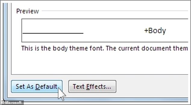
If you miss Calibri, you’ll be happy to know that there’s an easy way to get back to the vintage font
Open Microsoft Word and go to Home before selecting the Font Dialog Box Launcher.
Select Calibri and the format you want to use.
Select ‘Set as default’ and you’ll be asked to choose whether this applies to just this document or to all documents.
When you are satisfied with your selection, select OK twice.
