I’m a property expert and here are 10 big interior design mistakes that will put off potential buyers
When selling your home, first impressions are everything. The right furniture and furnishings can make your home attractive, but mistakes in this area can quickly put off potential buyers.
From cluttering rooms with too much furniture to outdated furnishings, Liv Conlon has seen it all when it comes to reasons why a house doesn’t sell.
Mother of one Liv is the CEO of The PropertyStagers that furnishes more than 300 homes per year to make them more attractive to potential buyers.
What’s more, seven-figure entrepreneur Liv, 25, originally from Glasgow but now based in Marbella, can also offer style advice to sellers looking to go above asking price – whether on a budget or a luxury home.
Here are Liv’s ten most common missteps that you can avoid to ensure your home is staged to perfection.
Liv Conlon, pictured, is the CEO of ThePropertyStagers, which furnishes more than 300 homes a year to make them more attractive to potential buyers
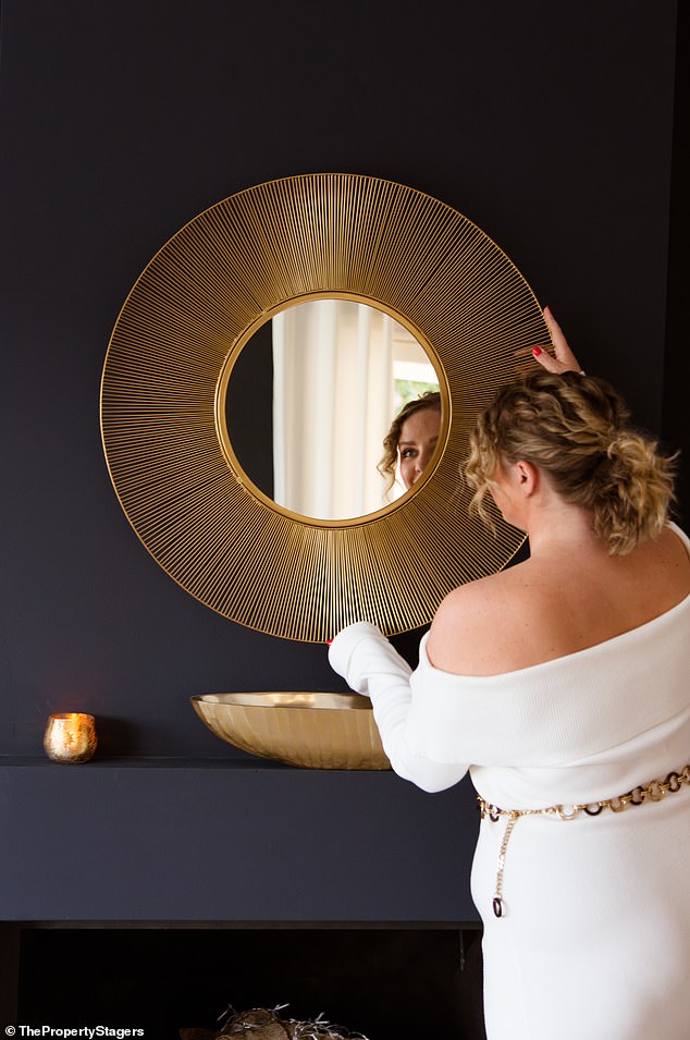
The 25-year-old in the photo, who is originally from Glasgow but now lives in Marbella, said you should keep the style consistent throughout the house
1. Overcrowding with furniture
There is a misconception that home stagers use smaller pieces of furniture to maximize the scale of a room, which isn’t always true. The real trick to furnishing your home for sale is placing statement pieces of furniture, which can be large, but not too much.
An overabundance of furniture can make a room feel cramped and small. Buyers are looking for spaciousness and flow, not a labyrinth of sofas and coffee tables. Opt for fewer pieces that serve multiple purposes and are appropriately scaled to the size of the room.
The layout of your furniture should highlight the best features of each room and facilitate movement. Avoid blocking windows, doorways and paths. Arrange furniture to create conversation areas and showcase space and functionality
2. Mismatched styles
Consistency is key in home staging. Mixing modern furniture with antique pieces can create a disjointed look that confuses buyers, just like mixing interior design styles. This does not just apply to one room, this applies to every room.
You want to create a cohesive style in every room of your home so that when surfing the Internet and browsing images or during an in-person viewing, a potential buyer doesn’t experience “interior whiplash” as they move from room to room. room.
You can assign a unique style or shade to the entire house on a budget. There is no need to redecorate your entire home. You can achieve this look with soft furnishings and accessories to create similarity between each room. To figure out which style best suits your home, you need to consider the end buyer. Are they a modern family, a trendy couple or an older target group?
3. Outdated furniture
In order to achieve the maximum possible offer for your home, people want to buy a home that is relevant today. Furniture that looks like it’s from a bygone era can date your home, making it less attractive to today’s buyers and jeopardizing your ability to achieve your desired price.
Outdated furniture insinuates a potential opportunity for renovation or a property sale, which insinuates that a bargain should be made as work is needed to bring the property’s value to its maximum value. Replace or reupholster dated pieces with more modern, neutral options that appeal to a wider audience.
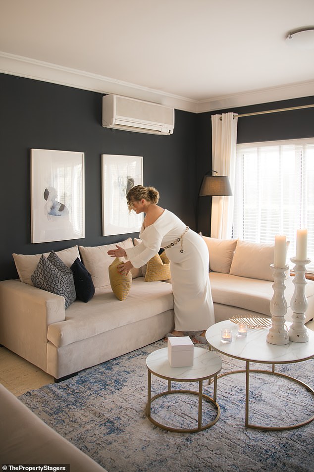
Liv first came up with the idea of organizing a house when she was 17. She realized that giving a home a showroom feel would lead to a faster sale.
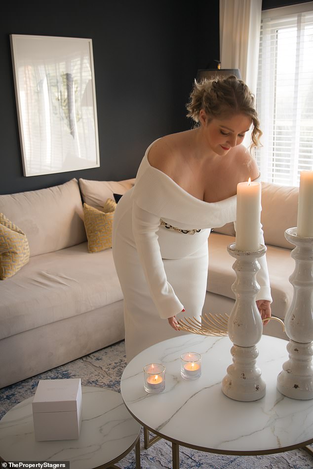
Liv suggested making sure you have a mix of mood, task and accent lighting to accent your furniture and create a warm, inviting atmosphere in bedrooms and living rooms.
4. Personalized furnishings
While your family photos and quirky collectibles have sentimental value, they can make it difficult for buyers to imagine themselves in your home, and often result in a cluttered atmosphere. Remove the majority of your family photo frames, inspirational quote plaques, and mementos from your trip so buyers can imagine adding their own personal touches.
5. Place your furniture around the TV
Modern people place all their furniture around their TV, but this is often the sub-optimal position for your large furniture pieces. The aim is to create a ‘wow’ effect at the entrance to each room, this translates into the bed facing you when entering the bedroom (unless you are facing a view where the viewer can imagine him waking up) or the couch placed towards the door. then the wall. This provides impressive visuals for your online presence and stunning responsiveness while watching.
6. Neglecting scale and proportion
Furniture that is too big or too small for a room can disrupt the balance and make the space feel uncomfortable.
Make sure all pieces are appropriately scaled to the dimensions of the room. For example, a huge sectional sofa in a small living room will dominate the space and make it feel claustrophobic, while a small sofa in a large living space will feel sparse and cheap. To create impact and focal points, consider oversized accessories, artwork and mirrors instead of furniture pieces that oppress the space.
7. Ignore lighting and accessories
A beautifully decorated room can still collapse if it is poorly lit. You could describe a room as poorly lit if there is too little light or if hanging lamps or spotlights are used throughout the house.
The only time the ‘big light’ is appropriate is in a small bathroom, kitchen or utility room where it is needed. For rooms that require ambiance, such as the bedroom or living room, make sure you have a mix of mood, task and accent lighting to highlight your furnishings and create a warm, inviting atmosphere.
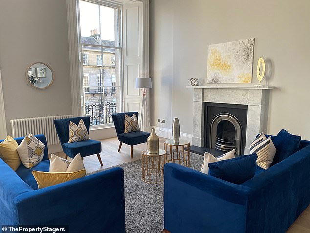
Furniture should not be centered around the TV in the living area, but this reduces the ‘wow’ effect of the layout
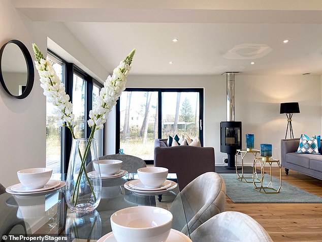
In general, stick to neutral colors and save brighter shades for accent colors
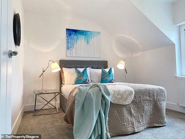
The bed should face you when you walk into the bedroom so that viewers can perfectly imagine you waking up in this room
8. Overly bright colors and patterns
While bold colors and patterns can express personality, they may not appeal to the majority of buyers. Stick to neutral tones for larger pieces of furniture and use brighter colors sparingly as accents. This will make your property appear online, but it won’t turn off those offended by audacity. This creates a versatile palette that appeals to more people and makes spaces feel larger and more inviting.
9. Worn or damaged furniture
Furniture that is visibly worn, stained or damaged can give the impression that the home has not been properly maintained. It immediately raises doubts in your buyer’s mind that defects can be found throughout the property, which will result in nitpicking and discount opportunities. Invest in repairing or replacing parts that show signs of wear to maintain a neat appearance, or if you’re on a budget.
10. Too much or too little furniture
Finding the right balance is essential. Too much furniture can overwhelm a space, while too little furniture can make the space feel sparse and unwelcoming. Aim for a balance that makes each room feel fully furnished yet spacious. When furnishing an empty space, consider which pieces will contribute to the aesthetic appeal of a property rather than a functional purpose. Choose a console table with lamps and mirror instead of a chest of drawers, choose a dressing table over a wardrobe. If you’re optimizing your own home, draw attention to vignettes in your home rather than functional items like media units or wardrobes.
Designing your home effectively is all about creating an inviting, functional and aesthetically pleasing space that potential buyers can see themselves living there. Avoiding these common furniture and decor mistakes can significantly enhance your home’s appeal, making it more attractive to buyers and potentially leading to a faster, more profitable sale. Remember that less is often more, and neutral, well-maintained furnishings will always be in style when it comes to selling a home.
Liv Conlon is the CEO of The PropertyStagers that furnishes more than 300 homes per year to make them more attractive to potential buyers.
