Gold Coast Suns boss’s brain-fart comment comes back to haunt him as AFL club launches new logo – and fans are furious
- Suns has undergone a major ‘brand refresh’ for 2025
- New logo has several hidden meanings
The Gold Coast Suns’ new logo has gone over like a lead balloon with fans, just days after the club’s CEO said he would be “gutted” if it ended up being the final design.
When the new look was accidentally leaked online by the AFL earlier this week, fans immediately started harping on it – and in their dismay they were joined by team boss Mark Evans.
“I’m not allowed to confirm if that’s the logo,” he said.
“If that was the logo I’d be disappointed, but there have been a few versions. Come by on Friday and we’ll reveal it here.’
The final design – which is virtually identical to the version in the leak that Evans responded to – was actually revealed on Thursday evening.
The Suns explained that the logo is intended to depict “the blazing sun of the Gold Coast rising over the horizon”, with a foot in the center of the emblem and a subtle G and C hidden within “as a nod to our history and original emblem’.
Gold Coast star Daniel Rioli was pictured modeling the club’s new look on Friday

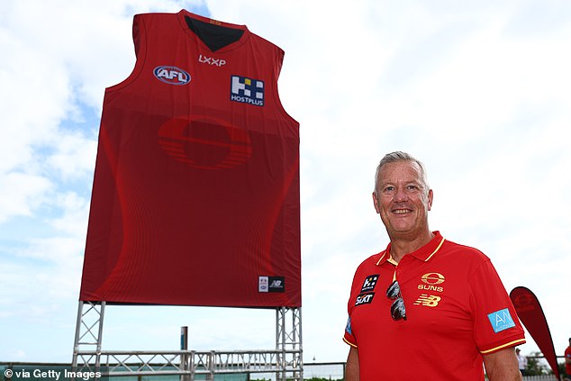
Suns CEO Mark Evans (pictured) previously said he would be ‘gutted’ if a leaked version of the redesign turned out to be real – and that’s exactly what happened

Pictured: The logo when it was accidentally leaked by the AFL earlier this week
What followed was a huge outpouring of footy fans who were overwhelmingly against the bold new look.
Many found the design lazy and difficult to see as it only appears in shades of red on the team’s home strip, while the old version was more noticeable as it mixed red with yellow.
“More effort has gone into these videos than the actual design of the logo and guernsey,” one fan wrote, referencing promo images of Gold Coast stars wearing the new look.
‘This is embarrassing. People thought the hold jumper was too boring and now you have one where it just looks red most of the time,” another commented.
‘Jumpers look blank. Can’t even see the logo. What a disaster,” a third added.
‘Rotten. The most effective professional sports team logos basically reveal three things: who they are, where they come from, and what they do. This logo fails spectacularly on all three counts. It looks like a fake retro TV network from the 70s. What consulting firm approved this?!” wrote another fan.
“I didn’t think it was possible to make a worse logo than the current one, I’m actually impressed with how they pulled that off,” a fifth commented.
After the logo was officially released, Evans changed his tune.

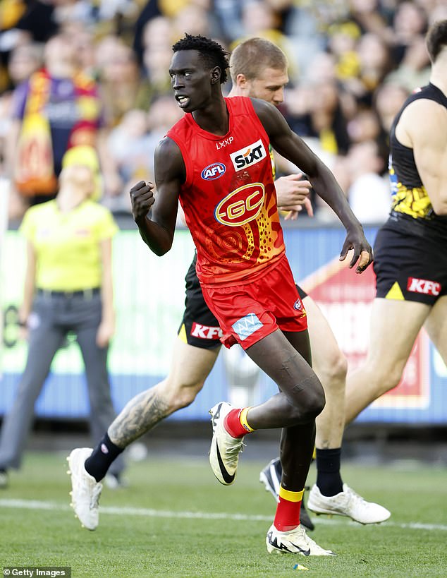
Gold Coast star Mac Andrew features in the club’s previous strip this season

Many football fans agreed with this commentator who lashed out at the new look on X
“We knew after 14 years with the same brand that it was time to refresh our look and feel to better reflect how we have evolved and matured as a football club,” he said in a statement.
“Our new logo is modern, bold and innovative, with layers of context that speak to our history and purpose.
“We are excited to show the world our new brand, and tomorrow we will unveil our new guernsey and color palette, marking the start of our new era.”
The reaction to the Suns’ new look comes after the Adelaide Crows were also blasted by fans when they released a new logo on November 7.
“It’s like going from Windows 10 to Windows 98,” one fan posted on X.
“Was this part of a primary school competition?” replied another.
“Well done to the 10 year old child of whoever put this together,” said a third.
The club said it was excited about the new look, saying in a press release that designers “gave a nod to the club’s heritage” with the original “diving” crow, but added that the sharpened claws, beak, eye and wing a ‘modern look’.
