Footy tragic claims the AFL accidentally leaked the Gold Coast Suns’ new team logo – and fans are NOT happy with the result
- Suns have never reached the AFL final before
- A rebranding may be implemented before the 2025 season
- The leaked image has been destroyed by supporters
The Gold Coast Suns could be the second AFL club to undergo a rebrand for the 2025 season after a footy fan unveiled a new logo that was reportedly leaked online.
The Adelaide Crows unveiled their new logo earlier this month after a poor run that saw the club miss out on a finals spot since 2017.
Now the Suns appear to be following suit after the Play AFL website reportedly accidentally published the new logo.
The new emblem was apparently displayed on welcome packs for Gold Coast Auskick players, before later being removed and replaced with the current Suns logo and colours.
The new design retains the oval theme of the original logo, but abandons the original GC lettering and now features an S shaped to resemble a setting sun.
Footy fans have captured screenshots of an alleged AFL leak showing the new Gold Coast Suns logo (pictured)

The Play AFL website has since been updated to show the old Gold Coast Suns branding

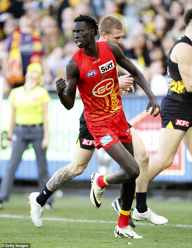
Gold Coast Suns star Mac Andrew is pictured wearing the club’s Indigenous Round shirt with the old logo
There is no confirmation yet whether the logo is final or authorized by the Gold Coast Suns, but fans are already lining up to condemn the new design.
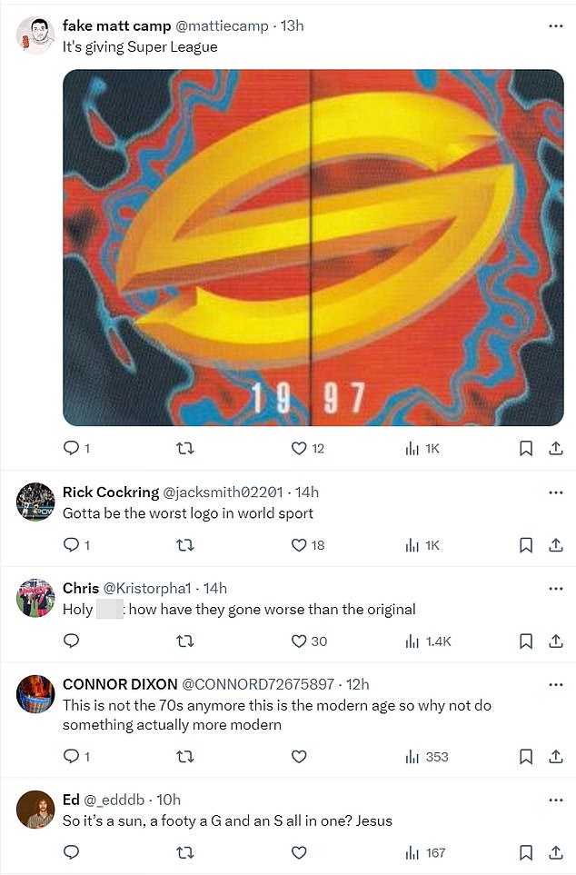
“It has to be the worst logo in world sport,” said one.
‘Holy f***, how did they get worse than the original?’ asked another.
“Gold Coast really doesn’t want to be taken seriously as a football team, does it?” read another mocking response.
The logo drew comparisons to the old Super League rugby league brand from 1997, the emblem of eyewear company Oakley and the symbol used by Supercars Championship team Erebus.
Others said it came across as a failed attempt to replicate the Adelaide Crows rebrand, which also attracted significant criticism.
“How could they ever do worse than the Crows?” one fan asked
“People are talking about crows now but this is next level,” wrote another.

Some Gold Coast supporters said they would be willing to adopt the new design, but only because they hated the original logo.
“I mean, it’s better than the old one. But that doesn’t mean much,” said a supporter.
“Definitely better than the old one, but that’s not a high bar,” another added.
‘The logo is slightly better than the original, but the original was one of the worst the world has ever seen. & are they just going to stick the logo back on the front of the guernsey?’ asked another fan.
“Funnily enough, I don’t hate this as much as I thought, but again I had very low expectations for their rebranding.”
While there was a flood of negative reactions, there are some optimistic fans who like the leaked image and hope this is what the Suns wear in their first ever finals series in 2025.
“Looks great actually, way better than any fan-made version I’ve seen,” one supporter fired back at the knockers.
“Initial thought yuk but it grew on me pretty quickly,” posted another.
“I hate how much I like it,” another admitted.
