Architect reveals how he transformed a damp, dilapidated $1.5million cottage into the best home on the street – and he didn’t blow his budget
An old, dilapidated cottage in Sydney’s west, which was ‘so dilapidated it was almost uninhabitable’, has been transformed into a coastal oasis.
Casey Scott, co-founder of Kinwolf Projects, and his team spent six months renovating the Balmain property, which was in desperate need of a “complete facelift.”
“It was a dark, rotting, wooden-plank house with mold and damp everywhere. The layout was horrible and super weird, because it went in and out of the neighbor’s house. So it was definitely a fixer-upper!” the 44-year-old told FEMAIL.
The original layout of the semi-detached house was awkward, consisting of a small dining room adjacent to the living room and kitchen, along with two bedrooms, a bathroom and a small courtyard.
It is now unrecognizable.
The two-story family home features a sleek white exterior, arched windows, a gourmet kitchen and an outdoor entertaining area, plus one more bedroom and two bathrooms.
“I changed the entire layout of the house to make living more intuitive and added an extension to maximise living space,” said Mr Scott.
“People want something that’s trendy, but they also want something that’s designed to be timeless. They want their home to still look beautiful in 10 years.”
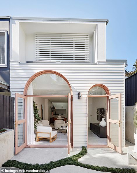
The Balmain home originally looked shabby and had an odd layout (front, left). Now it’s unrecognizable (right). Casey Scott, co-founder of Kinwolf Projects, and his team worked tirelessly on the project for six months.
The home was originally worth $1.5 million. The renovated cottage sold at auction for $3.25 million, well above the guide price of $2.75 million.
Balmain’s rich history is reflected in its classic, beautiful homes with period features, but Mr Scott said the new owners were young and wanted a ‘modern look’.
“I didn’t want to ruin the house – it’s a matter of finding the happy medium. I’m trying to make the house look better than it did when I got there, but it still looks like it’s been there for 100 years,” he said.
But the renovation also brought with it some challenges due to the limitations of the neighbourhood, including accessibility, on-site parking, its heritage and ‘its peculiarities’.
“The house was intertwined with the house next door. It wasn’t a straight line down the middle,” Mr. Scott added.
‘We were working with 1.2m bathrooms where the toilets barely fit in the space. So we really had to think about lighting and tile choices to maximise the space and make them more liveable and enjoyable to be in.’
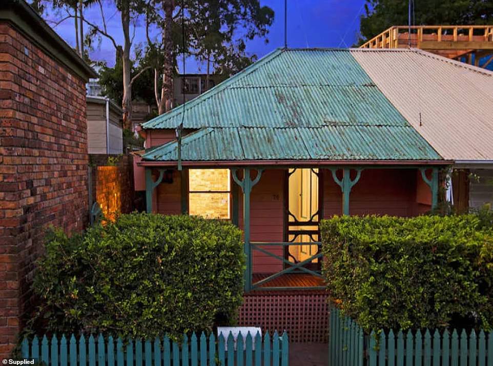
The original semi-detached house originally had a small dining room adjoining the living room and kitchen, along with two bedrooms, a bathroom and a small courtyard
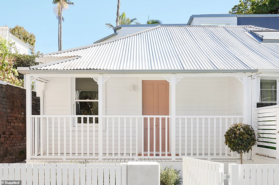
Just a stone’s throw from Mort Bay Park, the home is located in a sought-after suburb 5.5km from the vibrant CBD
The house is located just a stone’s throw from Mort Bay Park and only 5.5km from the CBD.
As guests walk through the front door, they are greeted by an open plan designer kitchen featuring a dishwasher, concealed double door fridge and multi-gas hob.
Downstairs there is a bedroom overlooking the street via a small balcony. The amount of natural light coming through the windows makes the bedroom feel spacious.
Under the stairs there is a combined toilet and laundry room and an area for outdoor relaxation.
The curves throughout the house, including the countertop and stairs, make the space seem larger than it is.
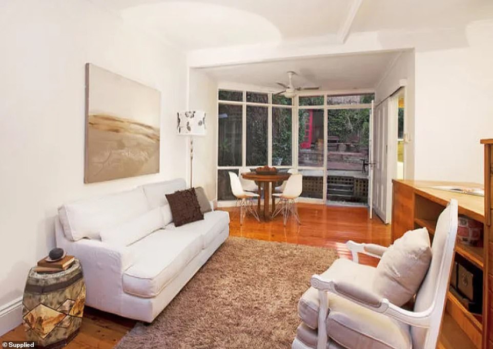
The house originally had wooden floorboards, low ceilings and was dark inside
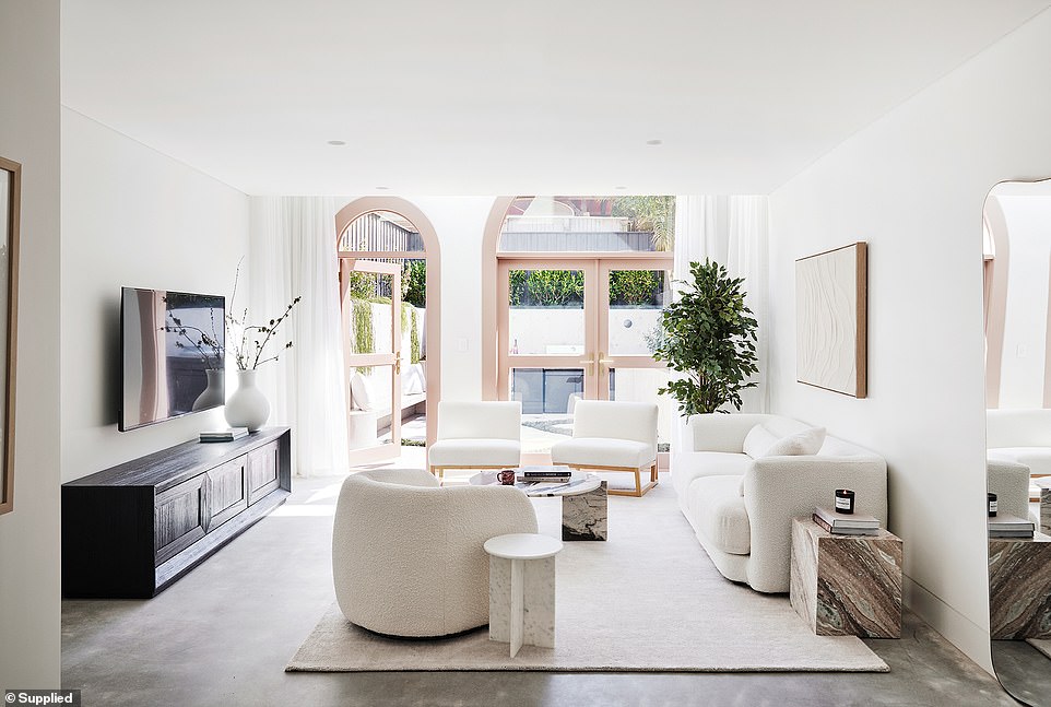
Now it looks like an oasis on the coast. As guests walk through the door, they are welcomed into this open space
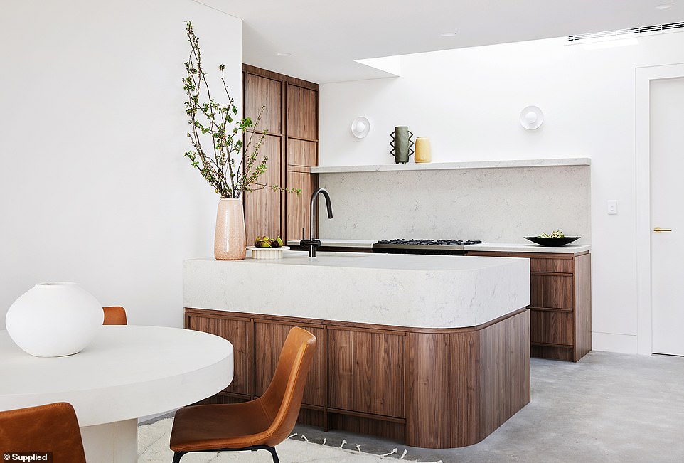
The kitchen is Mr. Scott’s (pictured) favorite part of the house. The curves throughout the house—including the countertops and the base of the stairs—make the space feel larger than it is.
“The arched doors leading to the backyard are one of my favorite features of the house. I loved the rawness of the concrete seeping from the inside out, and the mondo grass weaving through the concrete,” Scott said.
‘If we had chosen floorboards on the inside that transitioned into concrete on the outside, the backyard would have seemed smaller. So we created the illusion of a larger backyard by running the concrete throughout and draping lots of succulents along the walls.’
The kitchen is also Mr. Scott’s favorite place in the house.
“When you work in an inner city area like Balmain, you have to be creative with the layout of small spaces. By using built-in fridges and dishwashers, you eliminate clutter and create a sense of space where there wasn’t before,” he says.
‘I loved the wood we used in the kitchen and how well it matched the stone. The stone was leather polished (a matte finish) and had beautiful brown flecks in it that matched it perfectly. I’m a real texture person, I don’t like anything too shiny, so the matte finish really softened the space and made it earthy.’
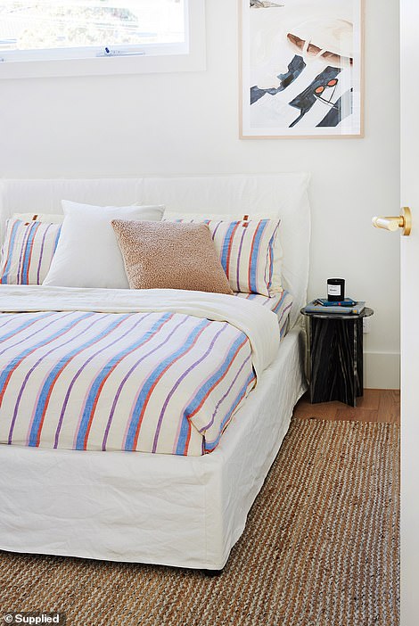
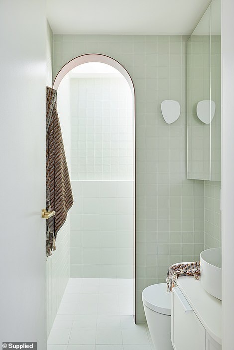
‘I changed the whole layout of the house to make living in it more intuitive and also added an extension to maximise the living space,’ said Mr Scott
According to Mr. Scott, the wrong color can make a small space look even smaller.
“We always put skylights over bathrooms, again to increase the perception of size, because natural light is so important. I try to bring natural light in from every space I can,” he added.
The renovation was completed within the $800,000 budget.
“In the current climate, costs continue to rise, but we always do our best to deliver our projects on time and on budget,” said Mr Scott.
